Stick Figure Sketchblog & Webcomic Creator @ Stewped.com


Webcomic - Adventures in Retail Webcomic - Chronic Malpractice Webcomic - Illustrated Thesaurus

Archive for the 'Design' Category

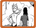
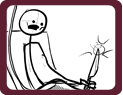
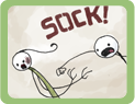
Denver Comic Con Banner Ideas

May 11th, 2013 by

2013-05-04 14.20.08

Rather than print my banner out, I am going to paint it on canvas. There’s the setup at right: canvas and PVC pipe. It will be a bit taller than that in the end. Right now, it’s about 6 feet.

So on to the ideas. I want some stick figures to feel larger than life! Plus, very strong lines of action are required. That’s what I enjoy and I want that to show through.

Looking at the pirate one now, it could be a lot stronger.

Which ones are your favorites? Pick 2!

Life is Pain 2 – the Revengening

April 8th, 2013 by

Here’s the other two images that I’ve fixed up. I think they work a lot better on this grey rather than the black I was messing with previously.
This kind of falls under the heading of preparing for Denver Comic Con. In case I haven’t mentioned it yet, I have a table there this year! Not sure where, yet. They haven’t notified anyone of table assignments so far.

I have more con prep stuff to share and I’ll be sure to update here with more con news.
life-is-pain-faceplant life-is-pain-eyepoke

Life is Pain

April 6th, 2013 by

Two new life is pain designs have finally been completed! I’ve been working super hard as I’d like to Kickstart these, plus some spruced up versions of the previous designs.

Also are the sketches I made the vectors out of.
toaster-tub shark-attack-01 toaster-tub page


Comic Fonts

August 12th, 2009 by

letter-r

I’ve been messing around with FontLab and ScanFont and boy is that a lot of work. Been messing with them for the past several weeks, probably since around when the dog was injured and only tonight did I have a breakthrough. You can see in the picture above how it looks as written and then blown up to gigantic by my scanner. The middle R is after several attempts to vectorize it with ScanFont and much tweaking inside the actual font program. The 3rd R is the one I just exported. It looks all smooth and sexy! I am now officially excited to make comic lettering fonts. Now that I’ve got that part down, there’s still fixing errors, metrics and kerning to mess with…

This is the pen nib that I wrote my letters with:

index finger nib

Some Logo Design

May 10th, 2009 by

I need to post something about a project that recently went up for sale in the iTunes App Store, but until I get my stuff together and make little ads for it so you can go and buy it, here is a logo I designed for another random comic series. It’s called Better Idea Comics. These are comics that sound like a Better Idea when you’ve been drinking. Then you make them when you sober up and find out something has gone wrong. There’s a color version and a black & white version. The color one has a bit of a gross scheme, as sometimes gross things happen when you drink too much.

Better Idea Comics

Fábrica de Heróis

May 10th, 2008 by

Fábrica de Heróis

Using the little flash app at the bottom of that page, I made Ultra Hitler. I even made him a snazzy logo.

Hitler- faster stronger

Ultra Hitler loves lookin good

After his right hand betrayed him and attempted to shoot him with his own gun, he had it removed and replaced with an atomic-powered hand created by Ernst Heinkel. Heinkel was working on nuclear powered robots when not researching propulsion for the Luftwaffe and Adolf liked where the future was heading. The atomic power source for the hand is contained in the pack on his back, which, through the miracle of radiation, has caused him to retain his youthful good looks and gain immense strength. He’s still a fan of khaki, but can you blame him when it looks so good? We look forward to seeing him fulfill his potential.