Stick Figure Sketchblog & Webcomic Creator @ Stewped.com


Webcomic - Adventures in Retail Webcomic - Chronic Malpractice Webcomic - Illustrated Thesaurus

Author Archive

Viking Birth Control Details

October 8th, 2012 by

I wanted to share a few closeups from my Viking Birth Control comic. There’s a big timelapse videoof me drawing, inking and coloring it over on youtube as well. I’m rather proud of the video. The comic turned out okay as well.

Viking Birth Control Sketches and the Importance of Thumbnails

October 1st, 2012 by

Viking Birth Control sketchesI don’t just throw these comics together; thumbnail sketches are super important! This is a scan of a 14″ x 17″ (35.6 x 43.2cm) sketchbook. I don’t make tiny little thumbs on tiny little pages. Here’s the comic if you need a refresher.

That’s right, I use the whole page. And I want you to see the whole thing, so beware: this is a big picture. Below I will try to walk you through this mess of a sketchbook page by corresponding to the letters and numbers I drew over the thumbs.

A) Here’s the original thumb. I really work well with the three-panel layout for my comics, so this is my default starting position.

B1 & B2) At some point I decided on four panels being the optimum quantity to get the comic across. It’s way better to do this during the planning stage than when halfway through the inking stage on the final comic.

C) Since I hand letter almost every comic, even the digital ones(I’ll tell you some other time how), I like to work out some of the word arrangement well before I start on the final comic.

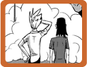
1) You can see the change from A to 1 that I rearranged the characters in panel 1. This also serves to put the word balloon first in the panel. The tail then points into the panel, leading the eye.

2) Panel 2 final decision. There are multiple versions of this all over the page before winding up on the final one. You can see them all over because who cares! Draw wherever you want. It’s your sketchbook.

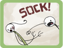
3) All versions of panel 3 look pretty much the same. Probably because I’m lazy, but how else do you draw a bunch of folks around a catapult that’s flinging a baby toward the horizon?

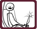
4) There’s only one sketch of the last panel because I(in my opinion) pretty much nailed it in the sketch. Was this the most successful version that could be made? Who knows? I wanted the father to be pushing the kid backward and in USA comics culture, anything going left is seen as the opposite of progress. Thus, the overbearing weight of the father’s arm is awkwardly pushing the kid backwards as he implies that the kid’s life will be sent in the opposite direction of progress, i.e., death.

More Thumbnailing

September 30th, 2012 by

Here are some more thumbs for a comic strip that I haven’t started working on yet. Other than these thumbs of course. I hope these are as interesting to you as other artists’ process pictures are to me.

Almost every thumb(disregard those two 9-panel grids on the left–that’s from an exercise in Drawing Words Writing Pictures) on the page deals with the second panel. Perhaps I’m over-thinking everything, but I don’t want all of my comics to just be talking heads and the like. I want interesting and dynamic camera angles. That’s what is so fun about comics! You can do anything because there are no physical limitations!

So when I see a strip that’s boring. Or composed poorly. And the word bubbles are awkwardly placed. All I can think is, “doesn’t the artist care?”

Jazu the Wanderer

August 6th, 2012 by

A couple friends are starting a comic project that will debut next year. In the mean time, they’ve released this little teaser image and a nice little video teaser as well. I immediately fall in love with the colors and the empty landscape. The composition on this little GIF file is superb. It brings to mind the PSN game Journey, but it also makes me think of all the fun I had wandering around in Shadow of the Colossus exploring that unpopulated world.

It sounds like they’ll be chronicling the creation of this comic on their bi-weekly podcast, Rabble Bytes, so I’d recommend heading over and subscribing if that’s the sort of thing you’re interested in.

I can’t wait to see how this turns out!

So-called Life Drawing

August 1st, 2012 by

Recently I discovered an approximation of an online figure drawing class. This Figure Drawing Training tool(NSFW if you choose the nude option) has an amazing option where it starts out showing you images of nude and/or clothed humans for 30 seconds, then ramps it up depending on how long you want to take the “class.” I started out with the 30-minute “trainer” class because I gotta get to work on some comics. I think that’s a pretty good time to start out. There were 30-second, one-minute, five-minute, and 11-minute images to draw from.

To let you guys know that I’m working hard at learnin’ stuff, here’s the images from tonight’s session. One thing is for sure: I am crazy out of practice.


Gatorchuting Sketches

July 25th, 2012 by

You may have noticed a fancy new page of the most exciting and classy new sport was posted. The next page is finally colored, but it’s not scheduled til next week. Can’t give this gold out too fast. Heh. Heh. Heeeehhh.

Anyway, here are the layouts/preliminary work that I did in Manga Studio for the pages 3 and 4 of the comic. After getting the “pencils” where I liked them, I printed them out on 11″x14″ bristol and inked them.

page3-sketch gatorchutingpage4-sketch gatorchuting

There’s only one page left to this saga. I only have one question for you: should I move the old comics UP in the gallery(make them more recent) or post the new ones back to 2008? How would you like to see them in the Chronic Malpractice archive?

Speed Up Comic Coloring with Lock Transparent Pixels

July 17th, 2012 by

A while ago I stumbled across Tony Cliff’s site and it on it there was this amazing tip for coloring your flat colors in Photoshop. It’s a very simple button on the layers palette, near where you lock your layer, called Lock Transparent Pixels. Instead of having to worry about flatting your characters and objects with very different colors so that you can easily select them with the wand tool later, you just click this button! It locks the transparency of the layer so that anything that’s got a filled in pixel, stays at that transparency.

For example, if you have pixels that are 100% transparent(0% opaque), 50% transparent(50% opaque), and 0% transparent(100% opaque), they will stay that way when you color over them!

The completely 100% transparent pixels won’t accept any color.
The 50% transparent pixels will accept the new color, but stay 50% transparent.
The 0% transparent  pixels will be 100% new color.

You don’t have to waste tons of time making and saving selections!

Watch the video I made below for a quick overview, it’s only 5 minutes. Blow it up to full-screen for the best results!

Then, if you want a static tutorial, check out Tony Cliff’s flatting tips with the lock transparent pixels button–which he learned from Kazu Kibuishi.

Amazing Geeky Fingerless Gloves

June 29th, 2012 by

It turns out my friend Steph makes the most amazing  fingerless gloves if you happen to enjoy comics, Doctor Who, Domo-kun, or video games. These two pairs arrived in the mail just yesterday, as I bought them for the wife’s birthday presents. If you look close, you can see the Doctor Hoo shirt that she’s wearing, her other birthday present. Never have I been so excited for knitting.

In other news, I have so many cool comics and tutorials I can’t wait to make and share with you all! Plus there’s this stopmotion project I’m working on… So busy!

Baby Grapin’

June 20th, 2012 by

Well, no use beating around the bush. This is probably the most offensive comic I’ve ever made. Your imagination is what makes it so terrible, so you are a willing participant in this atrocity.

In the end, I made a nice animated .gif file of the drawing process.

Did you know that the most important part of drawing a comic is including space for the word bubbles? When you are creating your thumbnails for the comic, be sure to include the general shapes of the bubbles, if not the words. That way, your comic won’t look super cramped and sad when you have to try to add the word bubbles and the dialogue in later.

baby graper process gif

Be careful with your nibs

April 16th, 2012 by

Around seven years ago I was inking a comic with nib and ink while simultaneously screwing around on the interweb. Probably g-chatting with someone. I’ve since stopped doing that. I had been putting the nib holder into my mouth to chat, like holding a cigarette between my teeth, then grabbing the holder and going back to work.

Eventually I got into a bit of a hurry and moved to grab the holder out of my mouth too quickly. The ink on the nib was still wet and the nib went straight into my thumb.

Some of these nibs are a lot sharper than they look and, much like a tattoo, it bled quite a bit. However, once the scab cleared up this little black dot was left under my skin.

Any time I’m writing or drawing I see this dot and think of all the fun I used to have when drawing. Need to get that feeling back.