Stick Figure Sketchblog & Webcomic Creator @ Stewped.com


Webcomic - Adventures in Retail Webcomic - Chronic Malpractice Webcomic - Illustrated Thesaurus

Archive for the 'Comics' Category

Viking Birth Control Details

October 8th, 2012 by

I wanted to share a few closeups from my Viking Birth Control comic. There’s a big timelapse videoof me drawing, inking and coloring it over on youtube as well. I’m rather proud of the video. The comic turned out okay as well.

Viking Birth Control Sketches and the Importance of Thumbnails

October 1st, 2012 by

Viking Birth Control sketchesI don’t just throw these comics together; thumbnail sketches are super important! This is a scan of a 14″ x 17″ (35.6 x 43.2cm) sketchbook. I don’t make tiny little thumbs on tiny little pages. Here’s the comic if you need a refresher.

That’s right, I use the whole page. And I want you to see the whole thing, so beware: this is a big picture. Below I will try to walk you through this mess of a sketchbook page by corresponding to the letters and numbers I drew over the thumbs.

A) Here’s the original thumb. I really work well with the three-panel layout for my comics, so this is my default starting position.

B1 & B2) At some point I decided on four panels being the optimum quantity to get the comic across. It’s way better to do this during the planning stage than when halfway through the inking stage on the final comic.

C) Since I hand letter almost every comic, even the digital ones(I’ll tell you some other time how), I like to work out some of the word arrangement well before I start on the final comic.

1) You can see the change from A to 1 that I rearranged the characters in panel 1. This also serves to put the word balloon first in the panel. The tail then points into the panel, leading the eye.

2) Panel 2 final decision. There are multiple versions of this all over the page before winding up on the final one. You can see them all over because who cares! Draw wherever you want. It’s your sketchbook.

3) All versions of panel 3 look pretty much the same. Probably because I’m lazy, but how else do you draw a bunch of folks around a catapult that’s flinging a baby toward the horizon?

4) There’s only one sketch of the last panel because I(in my opinion) pretty much nailed it in the sketch. Was this the most successful version that could be made? Who knows? I wanted the father to be pushing the kid backward and in USA comics culture, anything going left is seen as the opposite of progress. Thus, the overbearing weight of the father’s arm is awkwardly pushing the kid backwards as he implies that the kid’s life will be sent in the opposite direction of progress, i.e., death.

More Thumbnailing

September 30th, 2012 by

Here are some more thumbs for a comic strip that I haven’t started working on yet. Other than these thumbs of course. I hope these are as interesting to you as other artists’ process pictures are to me.

Almost every thumb(disregard those two 9-panel grids on the left–that’s from an exercise in Drawing Words Writing Pictures) on the page deals with the second panel. Perhaps I’m over-thinking everything, but I don’t want all of my comics to just be talking heads and the like. I want interesting and dynamic camera angles. That’s what is so fun about comics! You can do anything because there are no physical limitations!

So when I see a strip that’s boring. Or composed poorly. And the word bubbles are awkwardly placed. All I can think is, “doesn’t the artist care?”

Jazu the Wanderer

August 6th, 2012 by

A couple friends are starting a comic project that will debut next year. In the mean time, they’ve released this little teaser image and a nice little video teaser as well. I immediately fall in love with the colors and the empty landscape. The composition on this little GIF file is superb. It brings to mind the PSN game Journey, but it also makes me think of all the fun I had wandering around in Shadow of the Colossus exploring that unpopulated world.

It sounds like they’ll be chronicling the creation of this comic on their bi-weekly podcast, Rabble Bytes, so I’d recommend heading over and subscribing if that’s the sort of thing you’re interested in.

I can’t wait to see how this turns out!

Gatorchuting Sketches

July 25th, 2012 by

You may have noticed a fancy new page of the most exciting and classy new sport was posted. The next page is finally colored, but it’s not scheduled til next week. Can’t give this gold out too fast. Heh. Heh. Heeeehhh.

Anyway, here are the layouts/preliminary work that I did in Manga Studio for the pages 3 and 4 of the comic. After getting the “pencils” where I liked them, I printed them out on 11″x14″ bristol and inked them.

page3-sketch gatorchutingpage4-sketch gatorchuting

There’s only one page left to this saga. I only have one question for you: should I move the old comics UP in the gallery(make them more recent) or post the new ones back to 2008? How would you like to see them in the Chronic Malpractice archive?

Baby Grapin’

June 20th, 2012 by

Well, no use beating around the bush. This is probably the most offensive comic I’ve ever made. Your imagination is what makes it so terrible, so you are a willing participant in this atrocity.

In the end, I made a nice animated .gif file of the drawing process.

Did you know that the most important part of drawing a comic is including space for the word bubbles? When you are creating your thumbnails for the comic, be sure to include the general shapes of the bubbles, if not the words. That way, your comic won’t look super cramped and sad when you have to try to add the word bubbles and the dialogue in later.

baby graper process gif

Spider Pimp Progress – Part 2

April 14th, 2012 by

Beware! Some of these pics are rather large because I want you to see all the details. These are the final pics of the process for the Spider Pimp comic I just posted over at Chronic Malpractice.

This has inadvertently turned into a process blog for my comics, which is fine. I like seeing this sort of thing on other blogs, so why not do what I love seeing?

In the fourth image I’ve circled the nib that did the lettering and line inking. I love that nib. It’s a Hunt 512, I believe and it’s pretty great for everything. I have 3 of them for some reason.  I had to pick up a wrist brace this week due to the mouse-use at my job tearing me apart. I finished the last two panels with it on and I think it shows. It did force me to use more of my shoulder to ink, which it isn’t used to yet.
The last image shows AAALLLL of my nibs and nib holders. I’ve yet to use all the nibs on a project, but I’ve messed around with them. That shakespeare one is pretty fun, and the index-finger nibs are super fun.

If you look close you can see all the test scribbles underneath the comic after each dip into the ink.

Am I being arrogant with this? I worry about that. I don’t want to be arrogant.

Whoops

April 9th, 2012 by

Well look at that! Someone completely botched the month of February. And March.

Only 3 comics. Due to taxes, and holidays and finishing up the Life is Pain site.

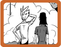
However, check out the progress of this comic I am inking! As you can see, this should have been finished in February, when I started it. I was just scared to ink it. However, it won’t get done if I don’t dive in and make a bunch of mistakes. As Jerzy and Rob and other people I’ve been reading about and listening to keep saying.

So I grabbed the following nib and dove in tonight! (it’s a super close-up big picture).

I have a bunch of nibs, but that one seemed good, and the best way to figure out what it’s good for is to just start doing everything with it. So everything in this comic will be inked with it. Fills on the silhouettes were done with a brush because I don’t have all night. And then I used the brush with some Pro White for the hairs in the shadows. Oh, yeah, the word bubble outline and the panel borders were inked with Rapidographs due to their ability to maintain a line with no variance in thickness.

The image above is 3-fold in its illustrative capacity: it shows the nib, the letters it inked, and the size of the letters via the Ames Lettering Guide(it’s size 4).
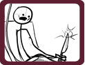
It took about an hour-and-a-half just to ink the letters and that first panel. Tomorrow night I hope to finish the rest of it and get back on track for putting out 8 comics a month. 4 for Chronic Malpractice and 4 for Illustrated Thesaurus. What a difference it is to think of, sketch, and ink a stick figure Thesaurus entry in only an hour versus this 3-panel, soon to be 6-hour event.

At least if you check this out you get a preview of the comic!

Then, while I was cleaning the pen nib, the whole assembly that holds it inside the handle popped out! Boooo-urns.

Not cool. It still works so it’s not that big a deal, but it’s my favorite holder! Look at the fancy swirls!

Strong Female Vloggers

February 11th, 2012 by

I’ve wanted to do this for so long! “This” being to make an animated GIF file of the JPEGs that Manga Studio spits out when you save your document. I just take that JPEG file and add a number to the end of it after specific saves. Then, when you save it again it creates a new JPEG. So I saved 9 of them over the course of drawing this comic and put them all together in flash with a little title image with the site’s logo. Pretty exciting for me, I hope you enjoy it.

strong female vlogger comic process

I probably should have put my thoughts on the subject of these types of ladies on this site, rather than the comic site, so the comic can speak for itself. It’s fairly ham-fisted, but I’m okay with that as these types of videos are kind of ham-chested.

Illustrated Thesaurus Originals

February 10th, 2012 by

illustrated thesaurus originals

If you’re an artist you know how great it feels to have your art on a nice thick piece of paper strewn about the floor of your artin’ room.

I started out drawing these poorly in a sketchbook. Eventually I moved to some series 300 Strathmore vellum bristol. In terms of a boring, white sheet of paper it is pretty great. I have a pad of plate bristol in another brand(borden & riley) and it’s awful. The ink spreads out and bleeds so that the artwork looks all fuzzy. Eww. However, the vellum of the borden & riley stuff is great and doesn’t bleed. I am almost out of the 9×12 pages that I use for the thesaurus entries, too *sad face.* If you want to be super nice and donate something so I can buy some more pads of this awesome paper, that would be great. If there’s any wallpapers or ATCs I can make as thanks, be sure to let me know in the comments or at aj dot stewped at gmail dot com.

I really want to make 2012 worthwhile for you visitors to any of my comics sites. I know that I’ve been a bit of a sappy screw-around the past 5, 6, 7 years? I think I started in 2003, posting stuff here and there. Then, due to some baloney or other I’d pitch a fit and give up for a month. Two months. 6 months. A year. Ugh. How embarrassing. Thanks, chrome, for telling me that there are two ‘R’s in embarrassing. However, this year is going to be different and awesome.
(more…)